30-Second Verdict
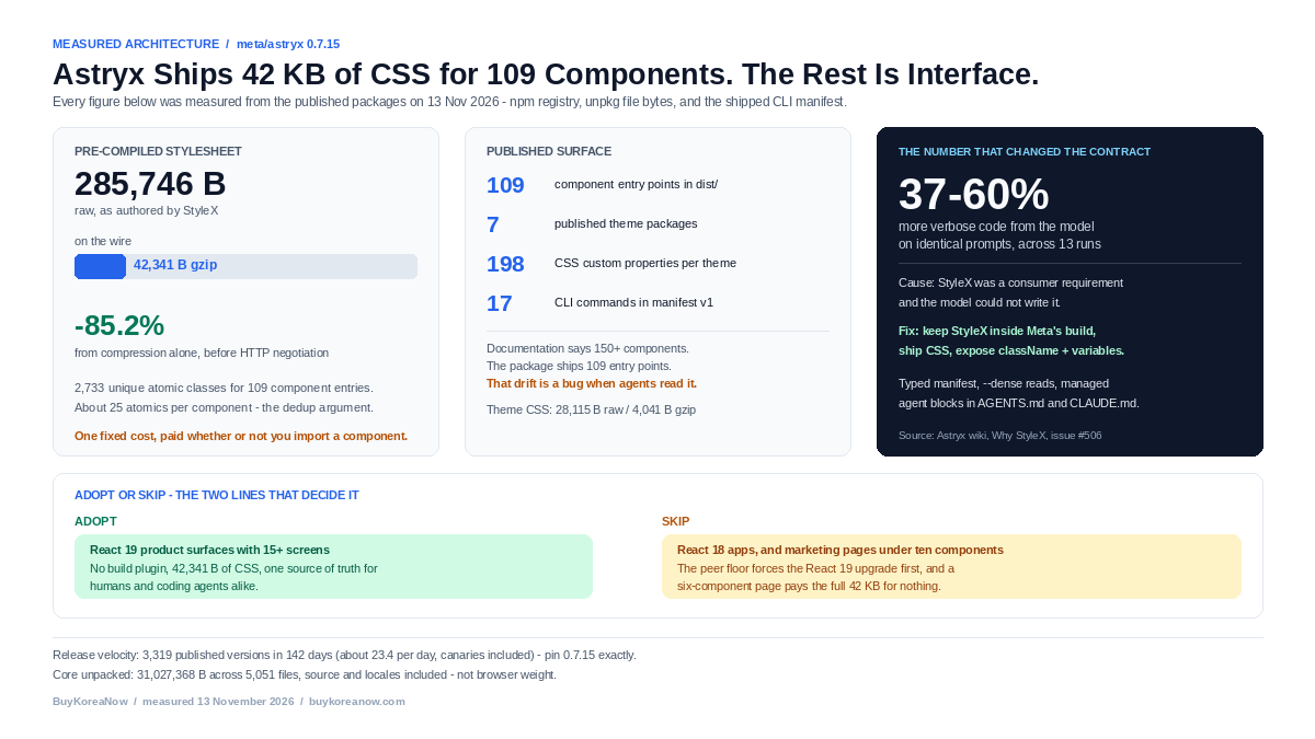
Meta Astryx (v0.7.15, MIT, published 12 November 2026) is a React 19-only design system that ships 109 component entry points and one pre-compiled stylesheet: 285,746 bytes, 42,341 bytes gzipped. StyleX stays inside Meta’s build, so consumers run no plugin. Theming is 198 CSS custom properties trapped behind @layer and @scope, and a typed CLI manifest lets a coding agent read the same docs a human reads. Adopt it for React 19 product surfaces. Skip it for React 18 apps and six-component landing pages.
The migration quote you fear is never the invoice. It is the sentence in the retro: “we cannot upgrade, the design system changed its mind about how styles work.” That sentence has cost more engineering hours across the 2020s than any single dependency in a modern frontend, because design systems historically asked you to adopt their compiler, their specificity, and their taste at the same time.
Meta’s Astryx is the first large design system I have benchmarked that splits those three apart on purpose. It is also the first one whose release notes read like a usability study of language models rather than a paint job. Both facts matter to anyone running a product with a small team — the agency owner with three client apps on three React versions, the solopreneur with a deadline looming and one agent doing the implementation.
I pulled the published packages, unpacked the CLI, measured the CSS, read the module graph behind swizzle, and diffed the marketing page against what ships. Here is the architecture, where the numbers hold, and where the documentation is already wrong.
What Meta Actually Shipped, Verified
The repository is meta/astryx: MIT licensed, created 9 January 2026, 26,612 stars and 2,066 forks as of 13 November, with 625 open issues and the last push at 02:03 UTC that morning. The packages are versioned as a fixed group, so core, CLI, and every theme carry the same number. Version 0.7.15 of @astryxdesign/core hit npm at 19:07 UTC on 12 November, exactly one day after 0.7.14.
Ten published packages: core, cli, build, and seven themes — neutral, butter, chocolate, matcha, stone, gothic, and y2k. React 19 or newer is a hard peer requirement. The only runtime dependency inside core is intl-messageformat; StyleX is a peer, and only if you compile from source yourself.
The headline claim on the README is that Astryx grew inside Meta over eight years, became the company’s largest and most-used design system, and powers 13,000+ apps. Read that number carefully. It describes Meta’s internal estate, not adoption of the open-source release, which the ecosystem headlines have been repeating all week. The artifact on npm is five months old, at 0.x, still marked Beta on its own docsite. That is not a reason to avoid it. It is a reason to pin exact versions and read the changelog, which runs to 1,039,768 bytes.
Astryx is an open source design system that grew inside Meta over the last eight years, where it became the most-used and largest design system in the company — powering 13,000+ apps and shaped by the engineers, designers, and product teams who depend on it every day.
Meta Open Source, Astryx repository README, retrieved 13 November 2026
One discrepancy surfaced immediately, and it matters when agents are your implementers. The README says 150+ components. The project’s System Architecture wiki says 90+. The published dist/ directory in 0.7.15 contains 109 component entry points — the PascalCase module directories I counted in a package of 5,051 files. Three numbers, one library, no shared definition of “component.” Hold that thought until we reach how the CLI feeds Claude Code and Cursor.
The 2026 Design-System Benchmark Table
The comparison below mixes measured values with documented behaviour, and I have marked which is which. Package weights come from the npm registry’s metadata for each project’s current latest tag, pulled on 13 November 2026. “CSS shipped” is what the package hands your browser before your own styles; “runtime work” is what happens at render time. Cells marked n/m were not measured in this audit, and I will not invent them.
| Signal | Astryx 0.7.15 | shadcn/ui (shadcn 4.23) | Radix UI primitives | Tailwind UI | MUI 9.5 |
|---|---|---|---|---|---|
| Style delivery | Pre-compiled atomic CSS, one file, @layer astryx-base | Tailwind classes copied into your repo | Unstyled; you supply all CSS | Tailwind classes in copied markup | Emotion runtime style injection |
| CSS shipped by the package | 285,746 B raw / 42,341 B gzip (measured) | 0 B; your build generates it | 0 B | 0 B; your build generates it | 0 B static; styles computed per render |
| Runtime styling cost | None; Theme sets variables only | None | None | None | Style serialisation and injection on mount and prop change |
| Unpacked package weight | 31,027,368 B / 5,051 files | 213,758 B (CLI only) | 107,250 B per primitive (react-dialog) | n/m (private distribution) | 8,503,169 B / 2,738 files plus Emotion 816,759 B |
| React 19 requirement | Hard peer, >=19.0.0 | Works on 18 and 19 (n/m) | Works on 18 and 19 (n/m) | n/m | n/m |
| First-party agent interface | Typed JSON manifest (apiVersion 1), 17 commands, writes agent files on init | add command reads registry JSON | None | None | Docs site only |
| Zero-lock-in path | className, CSS layers, swizzle to owned source | Source is yours from minute one | Source is yours; behaviour upgrades via package | Source is yours; no updates | Theme overrides inside the library’s API |
Unpacked weight makes Astryx look enormous — 31 MB against MUI’s 8.5 MB — but that count includes source, source maps, and every locale. What reaches a browser is the 42 KB gzipped stylesheet plus the components you import, each its own ESM entry point so tree-shaking works. The honest comparison is CSS-in versus CSS-out, not megabytes on disk.
The runtime row is where the architectures diverge. MUI and any Emotion-based system compute styles in JavaScript as components mount. Astryx does none of that; its Theme component is a pure CSS variable setter, and by the project’s own description there is no runtime style computation at all. That difference does not show up in a bundle analyser. It shows up in interaction latency on mid-range Android hardware, which is where most of the world reads your product.
StyleX Compilation: What the Build Does Before Your App Runs
Strip the branding and Astryx is a bet on one trade: pay the cost of a constrained authoring language inside the library so consumers pay nothing at all. Meta authors components in StyleX, a compile-time styling system whose purpose is to refuse certain code. A token that does not exist cannot be referenced. A raw hex value cannot sneak into a component. Off-scale spacing fails TypeScript before it reaches a browser.
For a design system, that constraint is the product. Twenty-nine teams styling buttons their own way is how a company ends up with four shades of grey and a contrast lawsuit. StyleX turns that social problem into a compiler error.
Then the build throws the authoring language away. The shipped astryx.css is flat, deterministic, atomic CSS wrapped in a cascade layer. I benchmarked it rather than trusting the description:
- 285,746 bytes raw, 42,341 bytes gzipped — an 85.2% reduction from compression alone, before any HTTP-level negotiation.
- 2,733 unique atomic class selectors, appearing 3,231 times across the file, for 109 component entry points. Roughly 25 unique atomics per component.
- 357 distinct custom properties consumed through
var(), which is how theming reaches every component without a rebuild. - 296 media queries and 11 feature queries, plus a block of
@propertyregistrations that tell the browser how to interpret StyleX’s internal variables before first paint.
Those 25 atomics per component are the whole argument for the approach. Atomic CSS deduplicates across a library: the fourth component that needs display:flex; align-items:center; gap:8px reuses the class the first three already emitted. The stylesheet grows sublinearly as the library grows, which is why 109 components fit in 42 KB gzipped. Per-component CSS modules at the same scale would produce tens of thousands of near-identical rules.
The cost is that you ship the union of every component’s styles whether or not you import it. A page rendering three components still downloads the whole 42 KB. For an internal tool with twenty screens that is a bargain; for a marketing page with one hero and one card it is a tax. Per-component CSS splitting would reintroduce the waterfall that atomic extraction exists to solve.
The other half of the trick is the layer. Everything Astryx emits lives inside @layer astryx-base, declared alongside reset and astryx-theme in a fixed order. Unlayered CSS always outranks layered CSS, so your Tailwind utility, your CSS module, or a single class you wrote at 2 a.m. wins against any Astryx default without !important. Most design-system override wars are specificity wars. This one is settled structurally.
Zero-Lockin CSS: Themes as Variable Sets, Not Forks
Theming is where Astryx separates itself from every system that treats a theme as a fork of component source. A theme is a set of CSS custom property overrides. Nothing else. The Theme component sets them; components read them through var(); the compiler never runs in your app.
I opened the neutral theme package and counted. Its compiled theme.css is 28,115 bytes raw, 4,041 bytes gzipped, and it declares 198 custom properties. Colour roles, border roles, text roles, per-status fills, card and section padding hooks — all named, all overridable one at a time. That is the difference between “our brand is blue” and “our brand is a nine-line patch we reapply after every upgrade.”
Underneath, the palettes are generated rather than hand-picked. Each theme ships a palette.config.json with a recipe identifier (astryx-oklch-v1), a 21-stop scale from 0 to 100 in steps of 5, a mode strategy of light-and-dark, and a vibrancy dial — 48 for butter, 16 for stone. Seeds and exact anchors pin the stops that carry brand meaning; the generator fills the rest in OKLCH. That is how seven themes stay perceptually consistent across 198 properties each without a designer babysitting nineteen greys.
The isolation mechanism is the part worth stealing even if you never install the package. The compiled theme wraps its rules in @scope ([data-astryx-theme="neutral"]) to ([data-astryx-theme]) inside the astryx-theme layer, and the neutral theme has four such blocks. The to() boundary is the important half: a nested [data-astryx-theme] subtree ends the outer theme’s reach. Drop a dark card into a light page and the outer theme stops at the card’s edge.
Mode switching stays declarative. The stylesheet keys off [data-theme="dark"] and [data-theme="light"] for explicit control and [data-astryx-media="dark"] for system preference, then sets color-scheme so scrollbars and form controls follow along. No JavaScript hook, no hydration flash to fix.
Overrides escalate in three documented steps: className for whatever CSS you already run, style for a dynamic one-off, and xstyle if your app also compiles StyleX. Components render stable class names — astryx-button primary md alongside the internal hashes — so a theme author can target .astryx-button.primary without depending on a generated class that changes on every patch. The internal x1jk2e-style names sit outside the contract, which is what lets Meta refactor internals without breaking anyone.
The Swizzle CLI: Owning Source Without Forking the Package
Every design system eventually meets the requirement its API did not anticipate: a variant that needs different DOM structure, a focus trap that must behave differently for accessibility reasons. Most systems answer with a wrapper. Wrappers breed wrapper wrappers. Astryx answers with ejection, and the implementation of that answer is the most technically interesting thing in the repository.
astryx swizzle Button starts by finding the component’s entry file — index.ts, index.tsx, or the folder’s top-level sources when no index exists — then walks its import graph with Babel’s parser. For each module the component reaches, the graph decides one thing: does this module come from the owner package’s public exports, or does the copy carry its source beside the component?
Public API stays an import, so you are not forked from the package’s own primitives. Internals come along, imports rewritten to relative paths, StyleX private attribute modules preserved because they encode invariants the component depends on. Carried helper files get the owner’s version stamped into their filename — layerStack.v0.7.9.ts, then layerStack.v0.7.9-2.ts on a second copy — so two swizzled components built at different versions coexist in one project without a name collision. Type-only imports are tracked separately, path traversal is blocked by an explicit containment check, and the command returns a machine-readable receipt instead of a friendly sentence, because the CLI’s primary consumer might be an agent that needs to verify what it just caused.
Then it hands you a GitHub issue link for the upstream package and, implicitly, a bill. Ejected source does not auto-update. Every future improvement arrives as a diff you must read and re-own. In my tests the ejected tree stayed small for a single component; the maintenance cost is the diff, not the file count. So swizzle the one component whose behaviour you genuinely cannot express through props, theming, and className, and leave the other hundred alone. Teams that swizzle broadly have rebuilt a fork with extra steps and no maintainer.
There is a second, quieter ownership path that most coverage missed: Astryx publishes a shadcn Registry compatibility layer. The registry serves static JSON per item — components, hooks, showcases, examples, blocks, templates — that the shadcn CLI can install, pinned in the documentation to shadcn@4.19.0 because the generated file transform is version-sensitive. It is additive, it does not require replacing existing shadcn components, and its URLs are locked against accidental renames by a reviewed route lock with aliases for prior paths. Meta is treating the rival’s distribution protocol as a delivery channel. That is either confidence or an admission, depending on which side of the migration you sit.
Agent-Ready Is an Interface Decision, Not a Marketing Line
This is the claim I expected to be decoration, and it is the one with actual engineering underneath. Four mechanisms do the work.
Documentation is data, not HTML. The CLI ships docs.generated.json, a 3.6 MB index that maps every documentation route to an [offset, length] pair rather than duplicating prose. Lookup is a slice, not a fetch. components.generated.json maps 1,564 route buckets to the component names each page demonstrates, which is how astryx component Button returns a component’s docs and its related templates in one call.
The command surface is a typed contract. manifest.generated.json declares apiVersion: 1, all 17 commands, every option with its enum choices and defaults, and every response type. Every command emits the same envelope: {apiVersion, type, package, data, meta} on success, {apiVersion, error, code, suggestions} on failure. An agent does not need to scrape help text to learn that swizzle refuses to run outside a project while component answers the same anywhere. It reads the field.
Agent files are managed, not dumped. astryx init renders a block from the project’s own catalog — installed components, templates, themes, integrations — and writes it into the conventions agents actually read: AGENTS.md, the project’s Claude Code file (CLAUDE.md or .claude/CLAUDE.md), .cursorrules, .hermes.md, and a one-line import inside GEMINI.md. Target selection covers claude, cursor, codex, hermes, muse, or all of them. Remove with the same command and it cleans up after itself, deleting a file it created when only its own heading remains. Nothing runs through a prompt, so behaviour is identical in CI and in a human’s terminal — the only way an agent-facing init can be trusted.
Token economy is a first-class flag. Global options include --dense for token-efficient reads, --detail full|compact|brief to choose how much of a component’s API comes back, and --zh for translated reads. A read that would cost thousands of tokens in full form can answer in a few hundred. What surprised me is that this is a product decision, not a debugging flag — someone at Meta counted the tokens.
Now the number that explains why all of this exists. Before 0.7, consumers had to run StyleX’s build plugins to use Astryx, and the project measured what that did to model-written code: across 13 vibe-test runs, Astryx output came out 37–60% more verbose than a shadcn plus Tailwind baseline on identical prompts, mainly because the model could not write StyleX and fell back to inline style objects. The fix was not a better prompt. It was deleting the requirement.
Vibe test data across 13 runs showed Astryx code was 37–60% more verbose than baseline (shadcn + Tailwind) on the same prompts — primarily because LLMs couldn’t write StyleX and fell back to
Astryx engineering wiki, “Why StyleX”, 28 October 2026, referencing issue #506style={{}}blocks. The solution: keep StyleX internally but remove it as a consumer requirement.
That is the release’s real thesis, and it generalises past Meta. If a design system’s API is not in a model’s training distribution, the model routes around it and writes worse code than a plainer alternative. Measured verbosity is a cost: more tokens per task, more surface to review, more chances to miss a bug. Keeping an exotic authoring language private while exposing plain props and CSS variables is not dumbing down. It is choosing the surface its implementers can reason about.
The Honest Catch
Five things would stop me deploying this on a client project tomorrow, and none of them appear on the landing page.
1. React 19 is a floor, not a suggestion. react and react-dom at >=19.0.0 are peer dependencies of core. If your product runs React 18 — mine do — this is a coordinated upgrade across the whole app before the design system can even mount. Budget that as a project, not an install.
2. The release train is fast enough to hurt. Core has published 3,319 versions since 24 June 2026 — 142 days, roughly 23 per day once canaries are counted. Stable releases follow a documented 0.x policy where the next minor is the breaking tier, and merges to main never publish stable. The engineering is disciplined: immutable release tags, npm trusted publishing over OIDC, provenance attestations, canaries gated behind a version declaration. “latest” is still a moving target. Pin 0.7.15 exactly, and upgrade deliberately.
3. Docs drift is now a correctness bug. The README says 150+ components, the architecture wiki says 90+, the package ships 109. The Distribution wiki documents a shipped astryx.md “machine-readable summary of all components” — that file returns 404 on unpkg for 0.7.15. When humans are the readers, stale docs cost a support ticket. When agents are the readers, a documented file that does not exist becomes a hallucinated import in a pull request. Verify against the installed package, not the wiki.
4. @scope is young. The theme isolation that makes nested theming safe depends on a CSS feature that shipped broadly only recently. Check your browser matrix, and if you support older Safari or an embedded webview, test the nested-theme case first. Everything else degrades gracefully because it is ordinary custom properties and layers; this one does not degrade, it simply does not apply.
5. Beta means API movement, and swizzle means you feel it. At 0.x, component internals can change in a minor. Twelve ejected components means twelve diffs to reconcile by hand every minor. The escape hatches are excellent; the exit from the escape hatches is manual.
Who Should Adopt It, and Who Should Skip
| Your situation | Verdict | Why |
|---|---|---|
| React 19 product surface, 15+ screens, more than one developer or agent writing UI | Adopt | Fixed 42 KB CSS cost, no build plugin, one source of truth for agents and humans |
| Agency maintaining 3–10 client apps with divergent styling conventions | Adopt with a wrapper | Theme as 198 variables lets each client brand differ without forking components |
| Solo founder shipping an internal tool or admin console | Adopt | Free forever under MIT, and the agent docs remove the discovery tax |
| React 18 app with a booked release | Skip for now | The peer floor forces the React 19 upgrade first |
| Marketing site with under ten components | Skip | You would ship 42 KB of CSS to render a hero and a card |
| Team that needs a 1.0 API guarantee this quarter | Skip | 0.x breaking tier is the next minor; pinning is mandatory |
| Deeply custom visual language with bespoke layout primitives | Skip | Radix primitives plus your own CSS will fight you less |
The decisive reason to take Astryx seriously is not the component count. It is that the system made its interface legible to the thing that now writes most of your UI code. Every other design system in this table optimises for the human who reads docs in a browser tab. This one treats the agent as a first-class client with a typed manifest, a token-efficient read mode, and a managed block in the files agents already open.
A Five-Step Migration Test You Can Finish on a Friday
Do not plan a six-week migration off a README. Run this instead, and let the measurements decide.
- Install exact versions and check the toolchain.
npm install @astryxdesign/core@0.7.15 @astryxdesign/theme-neutral@0.7.15 @stylexjs/stylex, thennpm install -D @astryxdesign/cli@0.7.15and runnpx @astryxdesign/cli doctor. Doctor reports peer mismatches before they become a white screen. - Import two stylesheets and one theme, then measure. Add
reset.cssandastryx.css, wrap the app in<Theme theme={neutral}>, and record the CSS payload delta in your network panel. If your app already shipped more than 42 KB gzipped of component CSS, this is close to break-even on day one. - Rebuild one real screen, not a demo. Pick the screen with the worst styling debt. Keep your own layout CSS and replace only the components. If the cascade layer holds you will not need a single
!important; if you do, you found a specificity dependency worth fixing anyway. - Run the agent, not just the keyboard.
npx @astryxdesign/cli init --agent all, then ask your coding agent in Cursor or Claude Code to build a settings page using only Astryx components. Count the tokens and the review comments. That is the only honest productivity measurement. - Eject once, on purpose. Swizzle the single component you know you will customise —
npx @astryxdesign/cli swizzle Button— and read the receipt. If the ejected tree is larger than you expected, that is the maintenance you are accepting later.
Before you schedule a React 19 migration across environments, read our Next.js 15 server action deployment-skew post; that failure mode has nothing to do with the design system you pick and everything to do with how you roll out. Token spend deserves the same care, since reasoning tokens bill as output in agent loops. A design system that answers a component query in 300 tokens instead of 3,000 is a line item, not a convenience.
The Bill That Comes After the UI: Distribution and Margin
Shipping the interface is the visible half of a launch. The invisible half decides whether anyone sees it and whether the unit economics survive the first hundred orders. Three of our own production tools cover that ground; the prices below are exact because the arithmetic is the argument.
FastLaunch 50 submits a new product to 50 directories averaging DR 65.4 within 48 hours. The labor comparison is straightforward: 50 forms at roughly 15 minutes each is 12.5 hours of manual copying, and at a $50 hourly contractor rate that is $625 of someone’s week. The flat price is $39, and the launch code LAUNCH29 takes a special discount of $10 to a flat $29 — a cost difference of $596, for one launch. Start at buykoreanow.com/fastlaunch or apply the code at the directory submission page.
The 2026 Solopreneur AI Complete Engine is the production stack our own builds run on: five framework-specific .cursorrules configs, four n8n workflow blueprints, a Next.js 15 server-action error-handling boilerplate, and a commercial licence. It is $49 against a $199 list price — 75% off — with instant download from the SaaS Matrix store. If you are about to rebuild the same scaffolding around Astryx, this is the cheaper side of the breakeven.
The ReturnWise margin defense kit is a CSV profit calculator that opens in Excel or Sheets plus the 2026 dispute-defense SOP we use when a marketplace return eats a week of margin. It is $19 against a $49 list. One mispriced return policy on a $40 average order at 200 orders a month is worth more than the kit costs, which is the ROI arithmetic that matters to a store operator. It lives at buykoreanow.com/returnwise.
None of these replace the design-system decision. A component library does not generate a single visitor, and the operator who plans the launch while planning the UI is still shipping in month six.
Frequently Asked Questions
Does Astryx require StyleX in my build? No. StyleX is Meta’s internal authoring tool; consumers import one pre-compiled stylesheet and typed components. StyleX appears in your dependencies only as a peer you must satisfy, and you compile from source only if you want atomic deduplication for your own stylex.create() styles.
Can I use it with Tailwind? Yes, and the package ships a bridge. tailwind-theme.css (12,061 bytes) maps Astryx tokens to Tailwind theme variables, so utilities and component props resolve to the same tokens. Because Astryx styles sit in a layer, utilities win on specificity without configuration.
What happens when Meta changes a component I swizzled? Nothing. That is the point and the cost. Ejected source is yours and does not auto-update; upstream fixes arrive as diffs you reconcile manually. The CLI’s upgrade command runs codemods for the package’s own API and refreshes shadcn-copied components, but it will not rewrite your customised copy.
Is 42 KB of CSS a problem for performance? It is a fixed cost, and fixed costs favour large surfaces. A 20-screen admin app amortises it across every route; a single-page marketing site does not. Measure the delta against what you already ship, and remember the stylesheet is cacheable and shared whereas per-route CSS-in-JS is not.
Does it work with Next.js server components? The styling is static CSS, so there is no runtime style work forcing a client boundary. Interactive components still carry use client, which is a property of the component, not of the styling system. Theme only sets CSS variables, so it composes with a server-rendered shell.
What is the single strongest reason to choose it over shadcn/ui? Continuity with updates. shadcn gives you source with no upgrade path by design; Astryx gives you a package, a documented escalation path, and an ejection command for the rare component you must own. If you have inherited a codebase where every shadcn component drifted three years behind upstream, that is the whole decision.

Leave a Reply